
As hurricanes loomed over the southeast United States, both the Washington Post and the New York Times consulted a database on a UWM professor’s website for information on these storms, past and present. What were they looking for that they couldn’t get from NOAA’s National Hurricane Center?
Clark Evans, a UWM professor of atmospheric science, and an expert on hurricanes and other severe storms, says the data the media outlets were looking for did come from the National Oceanic and Atmospheric Administration – but it wasn’t available in an accessible format. Evans’ website translates the data into an accessible format so that it can be used to create maps.
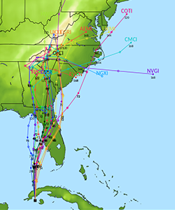
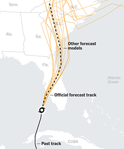
Since there are many different paths a storm might take, the National Hurricane Center must make their best prediction based on weighting all the real-time data from various computer models, plus their expertise and intuition. Using Evans’ database, the computer-model forecasts for any potential path can be mapped.
Here, Evans discusses his UWM storm database and its accompanying Twitter account.
He also explains why it’s so hard to predict a hurricane’s landfall, and the challenge of forecasting this for Hurricane Ian, which hit Florida Sept. 28, killing at least 130 people and causing an estimated $60 billion in damage.
When I look at your website, I see a list of storms by date and each one has a series of graphs attached. What am I actually looking at, and why did the media want it?
NOAA creates hurricane forecasts every six hours whenever there is an active storm. Then they put those data and the forecasts from a wide array of computer models on their website, but they are not straightforward to read. So, I take all of these data and translate them into a form that can be mapped.
There are usually two graphs for each time period – one that shows where the storm is forecasted to go and one that shows its forecasted intensity.
The entries are in Google’s KML files, which is a text-based format that can describe geographic information. I take the data from NOAA, process it on my end and create the KMLs.
The New York Times was looking for something that they could easily integrate into their visualization suite. And KML is a pretty common language, so they found my stuff and asked if I’d be willing to let them use it for their maps. The Washington Post was looking for historical data from Hurricane Andrew 30 years ago.
Tell us about your Hurricane Models Twitter account.
NOAA comes out with a new set of computer-modeled forecasts every six hours, which I then plot on my website. The model forecasts also appear on my automated Twitter account. That has about 8,100 followers now. I tend to get about 1,000 new ones each season.
It’s primarily a public service. People who follow are interested in seeing where tropical cyclones are going to go and their intensity. To mitigate the potential for people to hype unrealistic forecasts, I filter out the models that traditionally don’t do so well.
I started this database about 15 years ago as a graduate student, and I started providing the information in KML files about eight years ago.
Did Ian’s track surprise you?
I’ll preface this by saying that compared to the historical average, Ian’s track was about as hard to predict as any other recent storm would be on average.
But it was a little surprising just how much it consistently kept going further east of what the predictions were. Whether that be for its initial landfall in Florida or making it back out into the Atlantic Ocean before ultimately making it into the Carolinas, it was always a bit further east.
There’s some work at NOAA already underway to be able to better understand why that happened, and they have identified some potential culprits. But a lot more research needs to be done to be able to say anything concrete.
Why is landfall so hard to predict? It is because the storm could deviate at any point?
For Ian, I’ll use the analogy of where KK Avenue splits with First Street, near Bay View. Where the fork first occurs, there’s a very narrow difference in the directions that the two are going. But as each street gets further away from their intersection, the distance between them gets much larger. So, despite each continuing in their similar paths, they keep getting further and further apart.
For a storm like Ian where it was approaching a coast, a very small perturbation initially grows to a much larger difference over time. This can happen with sometimes hard-to-observe differences in the atmosphere.
And it becomes particularly impactful when it’s going more or less in the same direction as the coast. If Ian had moved just slightly further to the west two or three days before landfall, it very well could have ended up in the Tampa Bay area, 130 miles north of where it made landfall.