If you stop by the American Geographical Society Library at the University of Wisconsin-Milwaukee, you’ll likely catch yourself tipping your head to one side. At first, it might seem difficult to orient yourself while viewing many of the maps currently on display. But that’s the intention behind AGSL’s latest exhibit “Whose North Is It Anyway?”
Interim Head of AGSL and Public Services Librarian Georgia Brown and her interns Jayne Kilander and Catie Mendivil set out to subvert visitors’ expectations by curating a collection of maps where north is not at the top – a departure from the Western cartography many Americans are used to. The exhibit is divided into three approachable sections to guide your visit: religion, water, and nationalism.
The religion section features AGSL’s oldest map – the 1452 Mappamundi by Venetian cartographer Giovanni Leardo. For European Christian mapmakers like Leardo, you can expect to find maps oriented to the east because “it’s the direction that Jerusalem is, which is the most holy city,” Brown explained. Some of the maps in the religion section also feature imagery like a depiction of Jesus Christ or cross symbols. Similarly, Islamic cartography tended to place emphasis on centering Mecca, so many maps of this kind are oriented with south at the top, so the holy city is prominently displayed.
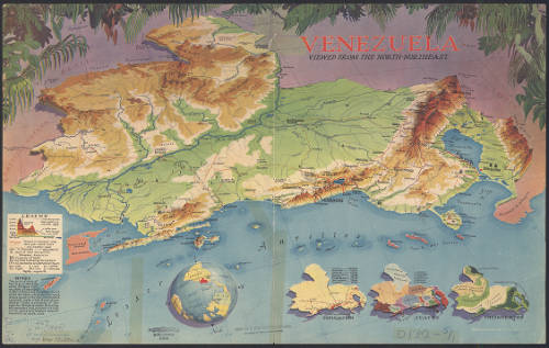
Other maps use different markers as points of orientation, like those seen in the water section of the exhibit. The 1939 map Venezuela Viewed from the North-Northeast by Richard Edes Harrison depicts the South American nation from the perspective of someone who might be flying in from East Coast hubs like New York City or Washington D.C. With maps like these, it’s important to look at them with a critical eye, because “there are certain hidden implications you have to tease out,” Brown said.
But for some mapmakers, the purpose of their maps is rather straightforward – to shine a spotlight on a country that’s normally relegated to the lower right-hand corner. This is the case for a couple of maps in the nationalism section of the exhibit: the 2014 Gregory’s Down Under Map of the World and the 2001 Kiwi Upside Down World Map. In these scenarios, the cartographers chose to put Australia and New Zealand right on top because, after all, those countries are “front and center in (their) own narrative,” Brown noted.
By the time you’ve made your way through the exhibit, you’ll have gotten a whole new perspective on what the world can look like. Brown wants visitors to know that the maps you’ll find in “Whose North Is It Anyway?” are not only intriguing to look at, they’re precise too.
“I try to really convey that just because it doesn’t look like what we’re used to, doesn’t make it less accurate in any way,” Brown said.
AGSL is free and open to UWM students and the public. Visitors can view “Whose North Is It Anyway?” Monday through Friday from 9 a.m. until 4:30 p.m. through the end of January, or online by checking out the digital exhibit StoryMap.