Brief Description (Alt Text):
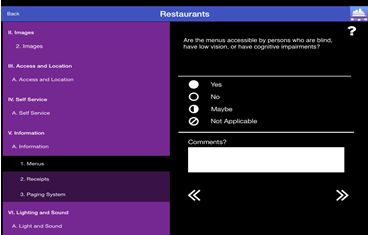
A screenshot of the AccessTools application interface that demonstrates the high contrast aesthetics of its design and shows how the raters will be presented with a breakdown of the taxonomy to navigate through the rating process.Essential Description (Caption):
This is a screenshot of the AccessTools App. It is opened in a evaluation with the left side showing options II through VI on a purple background. Under the roman numbers there are all of the sub-headings featured in white font. On the right half of the screen there is the opened rating screen for VI.A.1. At the top we see “Are the menues accessible by patrons who are blind, have low vision, or have cognative impairments?” shown in white text on a black background. Under there are the options of “Yes” “No”, “Maybe”, and “Not Applicable”. Below the options there is a “Comments” text with a white text box below.