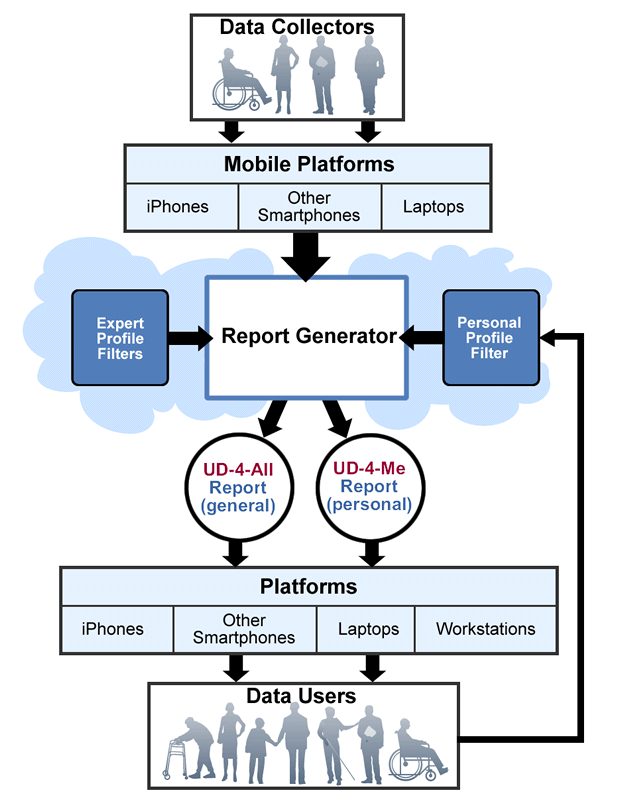
Brief Description (Alt Text):
ARB data generation and consumption flowchart demonstrating the flow of accessibility rating information from data collectors to data usersEssential Description (Caption):
Detailed diagram featuring different data collectors and a breakdown of users, reporters and platforms. Organized in table/ven-diagram display with blue and white color pallet.
Detailed Description (Description):
Graphic shows a flowchart with a box at the top labeled "Data Collectors" with four people icons in the box, one being in a wheelchair. Below there is a wider box labeled "Mobile Platforms" with a "iPhones", "Other Smartphones", and "Laptops" listed below in a horizontal line/ Below there is another box with "report generator" written in black bold lettering with two arrows pointing at it from boxes on the left and right. The box on the left is labeled "Expert profile filers". The box on the right is labeled "Personal profile filter". Below the middle box there are two arrows pointing down to two circles. The circle on the left says "UD-4-All Report (general)" and the circle on the right says "UD-4-Me Report (personal). From each circle there are arrows pointing down to a wide box with the title of "Platforms" and then divided horizontally into iPhones, other smartphones, laptops, and workstations. Below this box there are two arrows pointing down to a box labeled "Data Users" with 7 people icons all with different abilities.