OAIR develops dashboards for campus use on a variety of different data. While dashboards share many common characteristics, they are not identical. However, below are a few tips and tricks on how to use any of the dashboards we produce.
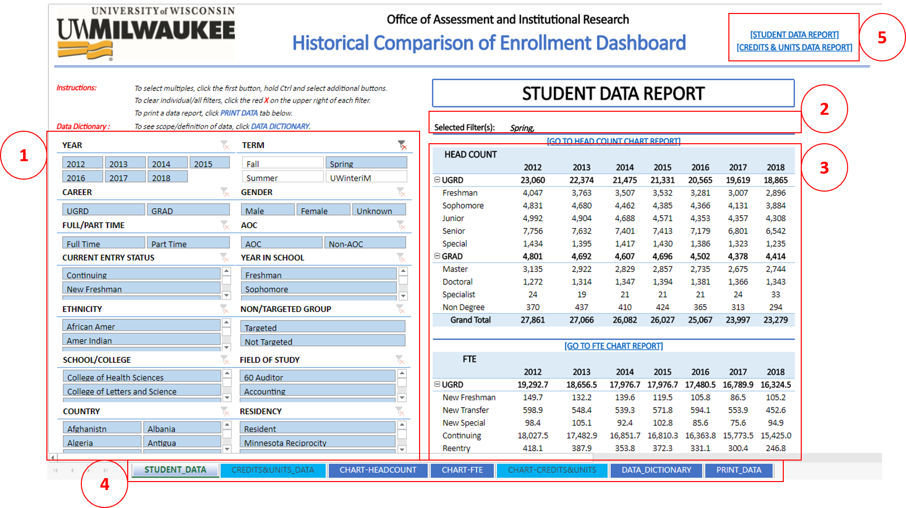
- Filters allow you to select and parse data to populations of interest.
- Most dashboards include a variety of filters such as year, term, career, race/ethnicity, current entry status, school/college, etc. For example, perhaps you are interested in examining enrollment data for new freshmen starting in Fall 2017. To do so you would select the following filters:
- Year = 2017
- AND Term = Fall (The “year” filter doesn’t select an academic year. Rather you need to combine year and term filter to specify a term like Fall 2017 or Spring 2018)
- AND Current Entry Status = New Freshmen.
- Selected items are in a default color. (For instance, in this example, selected items are in light blue whereas unselected items are in white. Dashboards may use different colors.)
- You may hold the Ctrl key to select multiple items within a single filter, e.g. perhaps you want to look at two or more school/colleges combined or two or more race/ethnicity designations.
- To clear selected filters, click the red X on the upper right of each. There is no one button to clear all selected filters. However, you can reload the page entirely and that will clear all filters.
- Selected Filter(s):
- This section of the dashboard reflects what filter(s) you have select. In this example, only the “Spring” term has been selected. Each additional selection will be show here as well, e.g. if both a spring term and UGRD career had been selected, the section would show “Selected Filter(s): Spring, UGRD”. You can use this as a way to ensure the filters you wanted selected are in play.
- Data/Report:
- This section reflects the data as filtered. Depending on the dashboard, the data/report may be presented in a table or a chart.
- In a table, if there is a +/- button, you can use it to expand/collapse a table.
- Tabs:
- Along the bottom, a dashboard may include multiple tabs that provide supplemental information including additional reports, charts, or printer friendly options. Filters selected in the first tab will apply to subsequent tabs.
- Some dashboards have a “PRINT_DATA” tab. This tab shows only data/report sections with only selected filters. The Filters section (section #1) is not included in a print version.
- Hyperlinks:
- A dashboard may include hyperlinks for different reports or charts. In the example, there are two main reports: Student data and Credits & Units data. You can use the hyperlinks to switch between these reports or you can also use the tabs in the bottom of the dashboard (See the instruction for Tabs, section #4).